Color Me Chic

Master color and transform your wardrobe

Color Blocking, the Grown-Up Version: Bold Panels Without the 2011 Flashback

2026-07-15

Quick Answer: Modern color blocking uses two colors, not four. Match their saturation — two jewel tones, two pastels, two earth tones — and anchor the outfit with one neutral in the shoes and bag. That’s the whole formula, and it’s what separates today’s version from the 2011 neon-panel era.

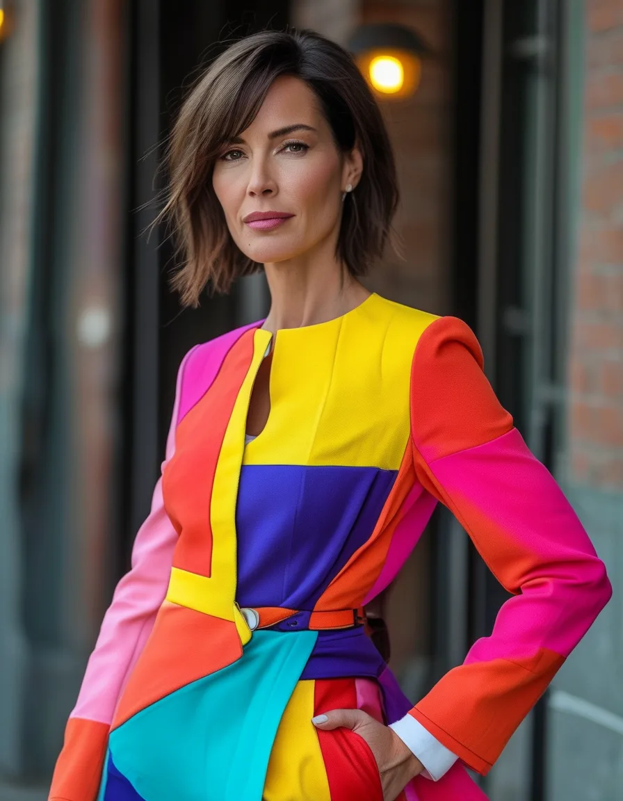
Color blocking’s first life was 2011. Neon panels, four colors per dress, geometry you could diagram. It burned very bright and dated in roughly eighteen months.

The technique survived, though. It just grew up — fewer blocks, matched intensities, and a neutral doing the grounding work. Bold color architecture, without the flashback.

Here are the grown-up rules.

Color Blocking, the Grown-Up Version: Bold Panels Without the 2011 Flashback

At a glance

How many colors should you color block?

Two. That’s the single most important edit between the modern version and the old one.

Cobalt trousers with a butter-yellow knit. Emerald skirt with a rust top. Two blocks read as a deliberate choice — they look like clothing that someone thought about. Four blocks read as a diagram, and diagrams age badly.

The 2011 version stacked colors in panels within single garments, which is why those pieces are unwearable now: the outfit was baked in and couldn’t be adjusted. Modern blocking happens between garments, so you’re mixing two separate pieces you can restyle in a dozen other ways tomorrow.

If you want a third color, put it somewhere small — a bag, a shoe, an earring — and keep the two main blocks doing the structural work.

Why do some color combinations look wrong?

Usually a saturation mismatch, not a hue problem.

This is the blocking-specific rule and it explains most failures. Colors block best at matched intensity. Two jewel tones (emerald and cobalt) sit together as equals. Two sherbets (lilac and butter) do the same. Two earth tones (rust and olive) likewise.

Pair a neon with a pastel and they fight for volume — the bright one shouts, the soft one apologizes, and the outfit looks unbalanced in a way that’s hard to name until you know what to look for.

Working combinations at each level:

  • Jewel + jewel: emerald/cobalt, ruby/sapphire, amethyst/teal.
  • Pastel + pastel: lilac/butter, mint/blush, powder blue/peach.
  • Earth + earth: rust/olive, terracotta/moss, camel/burgundy.
  • Bright + bright: cherry red/fuchsia, orange/hot pink, cobalt/lime.

Undertone still referees — warm colors sit more comfortably with warm, cool with cool. But intensity matching is the clause people miss, and fixing it solves more outfits than anything else on this page.

Color Blocking, the Grown-Up Version: Bold Panels Without the 2011 Flashback

What is the neutral anchor?

The third element that keeps the whole thing from tipping over.

Shoes and bag in a quiet neutral — cream, tan, black, chocolate — ground the two blocks. This is genuinely the difference between “colorful woman” and “color wheel incident,” and it costs nothing because you already own the shoes.

The anchor can also live underneath. Two colored pieces layered over white — a white shirt under a cobalt vest with yellow trousers — makes the blocking read editorial rather than costumed, because the white creates breathing room between the two blocks.

What doesn’t work as an anchor: a third bright color. If your shoes are also shouting, nothing in the outfit is holding still, and the eye has nowhere to rest.

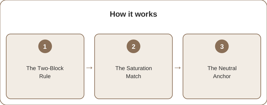
How it works

How do I start if bold color scares me?

Three entry points, from stake-free to committed.

  1. The accessory block. A green bag against a pink dress. You’re blocking at the smallest possible scale, it costs one accessory, and if it doesn’t work you take the bag off. This is where most people should start.
  2. The half-block. One colored piece against head-to-toe neutral. Cobalt trousers, cream everything else. It’s blocking with training wheels — you get used to seeing yourself in a saturated color without managing a second one.
  3. The matched set. A two-color knit set that someone already blocked for you. Zero decisions, and it teaches your eye what a good pairing looks like.

Then the full version: two garments, two matched-intensity colors, neutral shoes and bag.

The technique scales to any boldness budget, which is exactly why it survived when the neon panels didn’t.

5 Mistakes Everyone Makes

  1. Blocking three or four colors. The most common failure and the most direct route back to 2011. Two, plus a small accent if you must.
  2. Mismatching saturation. A neon with a pastel always looks like one of them wandered in from a different outfit.
  3. Skipping the neutral anchor. Bright shoes with two bright blocks leaves the eye nowhere to land.
  4. Ignoring proportion. A 50/50 split at the waist cuts you in half. A roughly 60/40 or 70/30 division — more of one color than the other — looks considerably better and is a two-second fix via a tuck.
  5. Wearing colors that don’t suit you just because they suit each other. Emerald and cobalt are a great pair and still wrong on some complexions. The combination has to survive contact with your face.

FAQ

Is color blocking still in style?

Yes, in its current, restrained form — two colors, matched intensity, neutral accessories. What’s out of style is the 2011 approach of multiple bright panels within a single garment. The modern version is closer to considered color pairing than to the graphic look of a decade ago.

What colors go well together for color blocking?

Pair colors of similar intensity: emerald with cobalt, lilac with butter yellow, rust with olive, cherry red with fuchsia. Complementary pairs (blue/orange, purple/yellow) create the strongest contrast; neighboring colors on the wheel (teal/green) create a subtler, easier-to-wear effect.

How do I color block without looking loud?

Keep it to two colors, choose muted or earthy versions rather than brights, use a lopsided proportion so one color dominates, and anchor with neutral shoes and bag. Rust and olive with tan accessories is color blocking, and nobody would call it loud.

TL;DR:

  • Two blocks, not four. That’s the core update from the 2011 era.
  • Match saturation — jewel with jewel, pastel with pastel, earth with earth.
  • Anchor with neutral shoes and bag, or a white base layer.
  • Aim for a 60/40 proportion rather than a 50/50 split at the waist.
  • Start with a colored accessory, then a half-block, then the full two-color outfit.

Keep Reading

This article is for general styling and informational purposes only. Trends, sizing, availability and pricing may vary by brand and season.

color blockingbold color outfitscolor pairing

← All articles