Butter Yellow: How to Wear the Color of the Season
Quick Answer: Butter yellow is a soft, cream-toned yellow that behaves almost like a neutral, which is why it flatters far more people than brighter yellows. Warm skin tones glow in golden butters; cooler tones suit paler, creamier versions. The four pairings that always work: butter with white, with denim, with grey or camel, and with chocolate brown.
Every season crowns a color. This one picked butter — and unlike most seasonal colors, this one is genuinely easy to wear.
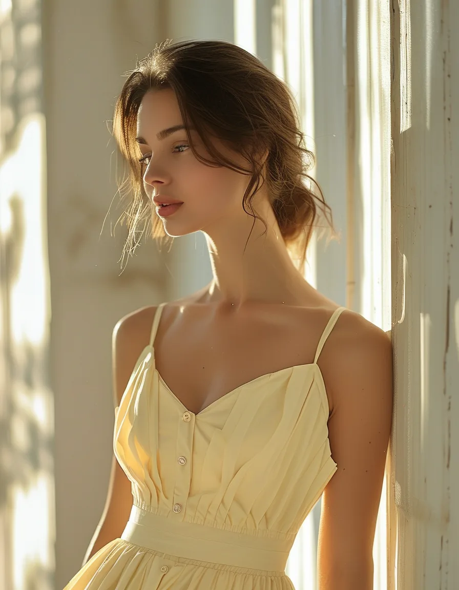
Where lemon shouts, butter glows. It’s optimism in fabric form, and it turns out to look good on a surprising number of people.
Here’s the butter yellow playbook.

Why does butter yellow work when other yellows don’t?
The cream undertone. That’s it — that’s the whole mechanism.
Bright yellows are highly saturated, which means they reflect a lot of color onto your face and compete with everything else you’re wearing. Butter yellow is desaturated and warmed with cream, so it behaves neutral-adjacent: it sits alongside your existing wardrobe instead of demanding a whole outfit built around it.
Gentle is the genius. A butter knit reads about as loud as oatmeal but feels like sunshine.
How do you find your butter yellow shade?
Butter is a spectrum, not one shade — which is why “yellow doesn’t suit me” usually isn’t true, it’s just imprecise.
Warm skin tones glow in golden butters, the ones with a little more depth and a hint of amber. Cooler tones shine in paler, creamier versions that lean almost toward vanilla.
Test it near your face in daylight, not under store lighting, which is warm and lies to everyone. Hold the fabric up and look at the skin under your jaw: if it looks brighter, that’s your shade; if it looks tired or slightly grey, move along the spectrum.
There’s a butter for essentially everyone. It’s a matter of finding the right point on the range.
What colors go with butter yellow?
Four pairings that always land:
- Butter + white — fresh, clean, the easiest one. Best in warm weather.
- Butter + denim — effortless sunshine, and the most everyday-wearable combination on the list.
- Butter + grey or camel — quiet luxury’s happier cousin. Grey cools it down, camel warms it up.
- Butter + chocolate brown — the fashion-forward pairing of the year, and the one that makes butter look expensive rather than sweet.
If you want a fifth: butter with black is sharper than you’d expect, as long as the butter piece is the larger one.

Where should you start, based on how bold you feel?
Toe-dip. A butter bag, a cap, sandals, or a scarf. The color shows up without changing your outfit’s logic, and accessories don’t have to flatter your skin tone because they’re not next to your face.
Midway. A butter tee or a fine-gauge knit. This is the version most people wear most often — enough color to notice, easy enough to pair with jeans on a Tuesday.
Full send. The butter dress or the butter suit. Both are genuinely striking, and both are simpler to style than they look because butter’s low saturation keeps the rest of the outfit calm.
Start where your confidence lives today. You can always move up the list.
Myth vs Fact: butter yellow
Myth: Yellow washes out pale skin. Fact: Bright, saturated yellow can. Butter’s cream undertone is much gentler, and paler, cooler versions of it work well on fair skin — the shade matters more than the color family.
Myth: Butter yellow is a spring-only color. Fact: It transitions cleanly into fall with grey and brown knits, and it sits beautifully next to winter white. Soft yellows historically cycle back every few years, so this isn’t a single-season purchase.
Myth: You need to commit to a whole outfit for a color trend to count. Fact: One well-placed butter piece against neutrals reads more deliberate than head-to-toe color. The bag or the knit does the job.
Frequently Asked Questions
Who can wear butter yellow?
Almost anyone, because it comes in a range. Warm skin tones tend to suit golden, deeper butters; cooler tones suit pale, creamy versions. If a shade looks off against your face, move along the spectrum rather than abandoning the color.
What’s the difference between butter yellow and pastel yellow?
Butter yellow has a cream, slightly warm undertone that gives it depth; pastel yellow is lighter and cooler, closer to a tint of pure yellow. Butter tends to look richer and less sugary, which is why it pairs so well with brown and camel.
Will butter yellow still be in style next year?
Soft yellows have cycled back repeatedly over the decades, and butter’s neutral-adjacent behavior means it doesn’t date the way a saturated trend color does. Buying it in a classic silhouette is a reasonable bet for several seasons.
TL;DR:
- Butter yellow’s cream undertone makes it behave like a near-neutral, so it’s far easier to wear than bright yellow
- Warm tones suit golden butters, cool tones suit pale creamy versions — test near your face in daylight
- Best pairings: white, denim, grey or camel, and chocolate brown
- Enter at your comfort level: accessory, then knit or tee, then dress or suit
- It transitions into fall with grey and brown, so it isn’t a single-season buy
Keep Reading
This article is for general styling and informational purposes only. Trends, sizing, availability and pricing may vary by brand and season.